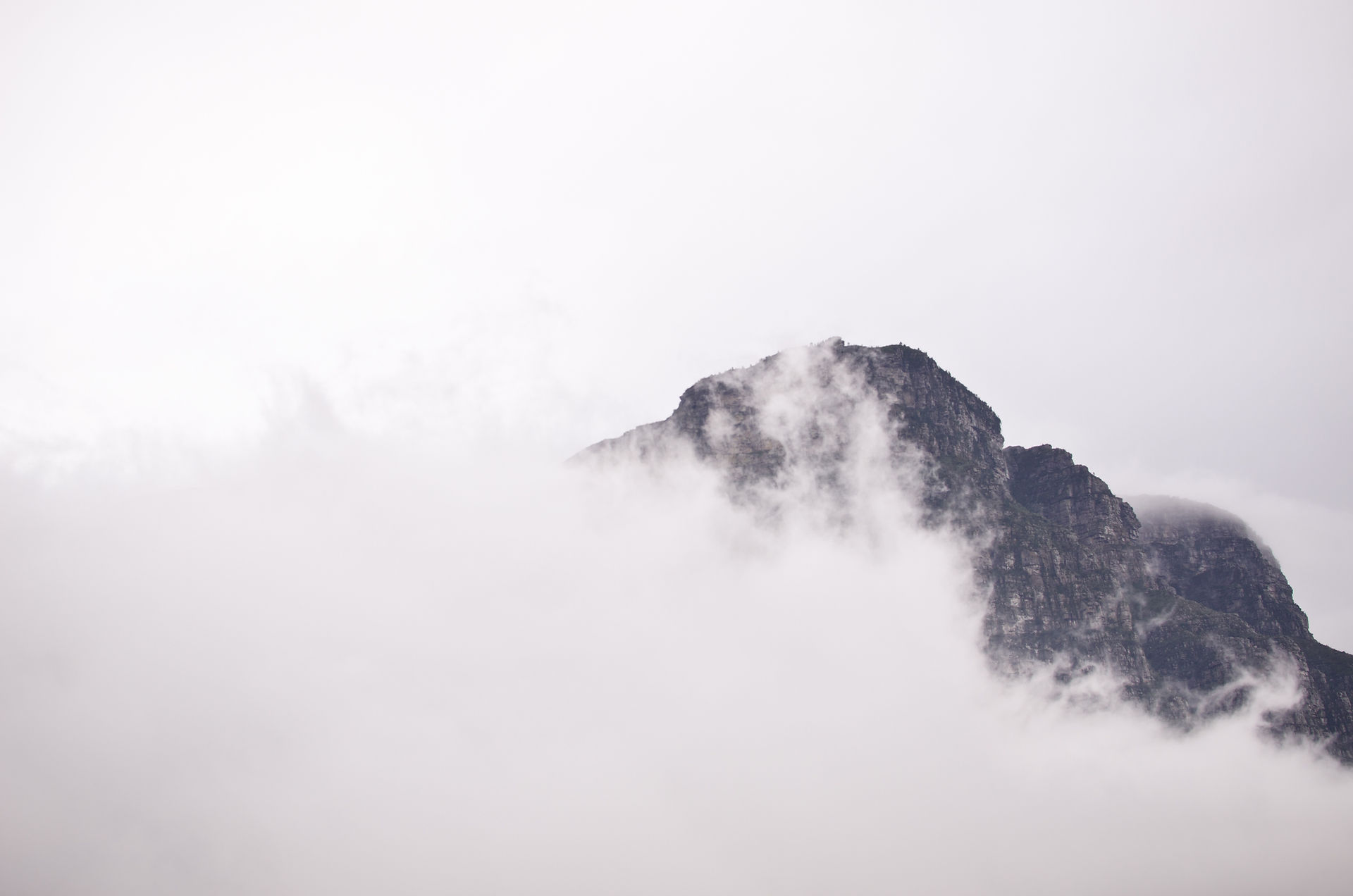
blurry
Blurry Photo
This is my photo. I was working with my mom and dad outside for a moment and I had the idea to get a garden shot of the front yard. I shot down low to give slightly different perspective than straight on and I think the fact it’s not exactly straight up and down—very slightly tilted—gives it a blurry, unfocused type feel. I used plastic wrap over my camera and tried to get the sunlight to hit just right. Then I oversaturated the hell out of it to give it an almost too bright look to blur out more color. I also used clarity and dehaze to blur it a tiny bit more and used grain to give it an older photo type look.

darkness
Darkness Photo
Using my phone, I used portrait mode to be able to use Stage Light and single out my plant. The two colored photos had the window open and the black and white photo had the window closed which had more natural day-time dark lighting. Even though it was a type of studio lighting via phone camera, I still touched up each photo from the original, playing with the properties and wave forms in Photos on both my phone and then my Mac.
One is colored, one is black and white, and the other resulted from a cool wave set on the RGB graph.


l i g h t
Light Photo
I took this photo while I was out getting sandwiches with my dad at Quiznos. We were eating on our tailgate when I remembered I had an assignment due the next day! Then I saw the sun was right overhead at about 13:00 and it was shining nicely through the leaves! I got a few shots, getting more street or more sky in the photos, but overall this one with the sun shining visibly onto the leaves makes them look that bright green that everyone thinks leaves should be!
